Я хочу "вырезать" верхний левый угол div, например, если вы сгибали угол страницы вниз.
Я хотел бы сделать это в чистом CSS, есть ли какие-нибудь методы?
Я хочу "вырезать" верхний левый угол div, например, если вы сгибали угол страницы вниз.
Я хотел бы сделать это в чистом CSS, есть ли какие-нибудь методы?

Если родительский элемент имеет сплошной цвет фона, вы можете использовать псевдоэлементы для создания эффекта:
div {
    height: 300px;
    background: red;
    position: relative;
}

div:before {
    content: '';
    position: absolute;
    top: 0; right: 0;
    border-top: 80px solid white;
    border-left: 80px solid red;
    width: 0;
}
P.S. Предстоящий border-corner-shape - именно то, что вы ищете. Слишком плохо, что он может быть отключен от спецификации и никогда не попадает в какие-либо браузеры в дикой природе: (
Если вам нужен прозрачный вырезанный край, вы можете использовать повернутый псевдоэлемент в качестве фона для div и поместить его для вырезания нужного угла:

body {
  background: url(http://i.imgur.com/k8BtMvj.jpg);
  background-size: cover;
}
div {
  position: relative;
  width: 50%;
  margin: 0 auto;
  overflow: hidden;
  padding: 20px;
  text-align: center;
}
div:after {
  content: '';
  position: absolute;
  width: 1100%; height: 1100%;
  top: 20px; right: -500%;
  background: rgba(255,255,255,.8);
  transform-origin: 54% 0;
  transform: rotate(45deg);
  z-index: -1;
}
<div>
... content ...<br/>... content ...<br/>... content ...<br/>... content ...<br/>... content ...<br/>... content ...<br/>... content ...<br/>... content ...<br/>... content ...<br/>... content ...<br/>
</div>Использование clip-path - новая альтернатива. Его начало все больше поддерживаться и теперь становится хорошо документированным. Поскольку он использует SVG для создания фигуры, он реагирует прямо из коробки.
div {
  width: 200px;
  min-height: 200px;
  -webkit-clip-path: polygon(0 0, 0 100%, 100% 100%, 100% 25%, 75% 0);
  clip-path: polygon(0 0, 0 100%, 100% 100%, 100% 25%, 75% 0);
  background: lightblue;
}
<div>
<p>Some Text</p>
</div> Вы можете использовать linear-gradient. Допустим, у родительского div было фоновое изображение, и вам нужно, чтобы элемент div располагался поверх него с серым фоном и лево-ушастым углом. Вы могли бы сделать что-то вроде этого:
.parent-div { background: url('/image.jpg'); }
.child-div {
   background: #333;
   background: linear-gradient(135deg, transparent 30px, #333 0);
}
Дальнейшее чтение:
Вот еще один подход, использующий CSS transform: skew(45deg) для создания эффекта углового угла. Сама форма включает в себя три элемента (1 реальный и 2 псевдоэлемента) следующим образом:
div имеет overflow: hidden и создает левую рамку.:before, который составляет 20% высоты родительского контейнера и имеет привязку к нему. Этот элемент создает границу на верхней и наклонной границе с правой стороны.:after, который составляет 80% высоты родителя (в основном, оставшейся высоты) и создает нижнюю границу, оставшуюся часть правой границы.Полученный результат является отзывчивым, создает прозрачный разрез сверху и поддерживает прозрачные фоны.
div {
  position: relative;
  height: 100px;
  width: 200px;
  border-left: 2px solid beige;
  overflow: hidden;
}
div:after,
div:before {
  position: absolute;
  content: '';
  width: calc(100% - 2px);
  left: 0px;
  z-index: -1;
}
div:before {
  height: 20%;
  top: 0px;
  border: 2px solid beige;
  border-width: 2px 3px 0px 0px;
  transform: skew(45deg);
  transform-origin: right bottom;
}
div:after {
  height: calc(80% - 4px);
  bottom: 0px;
  border: 2px solid beige;
  border-width: 0px 2px 2px 0px;
}
.filled:before, .filled:after {
  background-color: beige;
}

/* Just for demo */

div {
  float: left;
  color: beige;
  padding: 10px;
  transition: all 1s;
  margin: 10px;
}
div:hover {
  height: 200px;
  width: 300px;
}
div.filled{
  color: black;
}
body{
 background-image: radial-gradient(circle, #3F9CBA 0%, #153346 100%);
}
<div class="cut-corner">Some content</div>
<div class="cut-corner filled">Some content</div>Если вам нужна диагональная граница вместо диагонального угла, вы можете сложить 2 деления с каждым псевдоэлементом:
DEMO
http://codepen.io/remcokalf/pen/BNxLMJ
.container {
  padding: 100px 200px;
  overflow: hidden;
}

div.diagonal {
  background: #da1d00;
  color: #fff;
  font-family: Arial, Helvetica, sans-serif;
  width: 300px;
  height: 300px;
  padding: 70px;
  position: relative;
  margin: 30px;
  float: left;
}

div.diagonal2 {
  background: #da1d00;
  color: #fff;
  font-family: Arial, Helvetica, sans-serif;
  width: 300px;
  height: 300px;
  padding: 70px;
  position: relative;
  margin: 30px;
  background: #da1d00 url(http://www.remcokalf.nl/background.jpg) left top;
  background-size: cover;
  float: left;
}

div.diagonal3 {
  background: #da1d00;
  color: #da1d00;
  font-family: Arial, Helvetica, sans-serif;
  width: 432px;
  height: 432px;
  padding: 4px;
  position: relative;
  margin: 30px;
  float: left;
}

div.inside {
  background: #fff;
  color: #da1d00;
  font-family: Arial, Helvetica, sans-serif;
  width: 292px;
  height: 292px;
  padding: 70px;
  position: relative;
}

div.diagonal:before,
div.diagonal2:before {
  content: '';
  position: absolute;
  top: 0;
  left: 0;
  border-top: 80px solid #fff;
  border-right: 80px solid transparent;
  width: 0;
}

div.diagonal3:before {
  content: '';
  position: absolute;
  top: 0;
  left: 0;
  border-top: 80px solid #da1d00;
  border-right: 80px solid transparent;
  width: 0;
  z-index: 1;
}

div.inside:before {
  content: '';
  position: absolute;
  top: -4px;
  left: -4px;
  border-top: 74px solid #fff;
  border-right: 74px solid transparent;
  width: 0;
  z-index: 2;
}

h2 {
  font-size: 30px;
  line-height: 1.3em;
  margin-bottom: 1em;
  position: relative;
  z-index: 1000;
}

p {
  font-size: 16px;
  line-height: 1.6em;
  margin-bottom: 1.8em;
}

#grey {
  width: 100%;
  height: 400px;
  background: #ccc;
  position: relative;
  margin-top: 100px;
}

#grey:before {
  content: '';
  position: absolute;
  top: 0;
  left: 0;
  border-top: 80px solid #fff;
  border-right: 80px solid #ccc;
  width: 400px;
}
<div id="grey"></div>
<div class="container">
<div class="diagonal">
<h2>Header title</h2>
<p>Yes a CSS diagonal corner is possible</p>
</div>
<div class="diagonal2">
<h2>Header title</h2>
<p>Yes a CSS diagonal corner with background image is possible</p>
</div>
<div class="diagonal3">
<div class="inside">
<h2>Header title</h2>
<p>Yes a CSS diagonal border is even possible with an extra div</p>
</div>
</div>
</div>Этот код позволяет вырезать углы с каждой стороны прямоугольника:
div {
  display:block;
  height: 300px;
  width: 200px;
  background: url('http://lorempixel.com/180/290/') no-repeat;
  background-size:cover;

  -webkit-clip-path: polygon(10px 0%, calc(100% - 10px) 0%, 100% 10px, 100% calc(100% - 10px), calc(100% - 10px) 100%, 10px 100%, 0% calc(100% - 10px), 0% 10px);
  clip-path: polygon(10px 0%, calc(100% - 10px) 0%, 100% 10px, 100% calc(100% - 10px), calc(100% - 10px) 100%, 10px 100%, 0% calc(100% - 10px), 0% 10px);
}
http://jsfiddle.net/2bZAW/5552/

При небольшом изменении кода Джозефа элемент не требует сплошного фона:
div {
    height: 300px;
    background: url('http://images2.layoutsparks.com/1/190037/serene-nature-scenery-blue.jpg');
    position: relative;
}

div:before {
    content: '';
    position: absolute;
    top: 0; right: 0;
    border-top: 80px solid white;
    border-left: 80px solid rgba(0,0,0,0);
    width: 0;
}
http://jsfiddle.net/2bZAW/1921/
Это использование ' rgba (0,0,0,0)' позволяет внутреннему "углу" быть невидимым .
Вы также можете редактировать 4-й параметр 'a', где 0 < a < 1, чтобы иметь тень для большего эффекта "сложенного угла":
http://jsfiddle.net/2bZAW/1922/ (с тенью)
ПРИМЕЧАНИЕ. Значения цвета RGBA поддерживаются в IE9 +, Firefox 3+, Chrome, Safari и в Opera 10 +.
У нас была проблема разных цветов фона для наших вырезанных элементов. И мы хотели только верхний правый и нижний левый угол.

body {
 background-color: rgba(0,0,0,0.3)

}

.box {
 position: relative;
 display: block;
 background: blue;
 text-align: center;
 color: white;
 padding: 15px;
 margin: 50px;
}

.box:before,
.box:after {
 content: "";
 position: absolute;
 left: 0;
 right: 0;
 bottom: 100%;
 border-bottom: 15px solid blue;
 border-left: 15px solid transparent;
 border-right: 15px solid transparent;
}

.box:before{
	border-left: 15px solid blue;
}

.box:after{
	border-right: 15px solid blue;
}

.box:after {
 bottom: auto;
 top: 100%;
 border-bottom: none;
 border-top: 15px solid blue;
}


/* Active box */
.box.active{
	background: white;
	color: black;
}


.active:before,
.active:after {
 border-bottom: 15px solid white;
}

.active:before{
	border-left: 15px solid white;
}

.active:after{
	border-right: 15px solid white;
}

.active:after {
 border-bottom: none;
 border-top: 15px solid white;
}
<div class="box">
Some text goes here. Some text goes here. Some text goes here. Some text goes here.<br/>Some text goes here.<br/>Some text goes here.<br/>Some text goes here.<br/>Some text goes here.<br/>Some text goes here.<br/>
</div>
<div class="box">
Some text goes here.
</div>
<div class="box active">
Some text goes here.
<span class="border-bottom"></span>
</div>
<div class="box">
Some text goes here.
</div>В соответствии с решением линейного градиента Гарри (ответил 14 октября 15:15 в 9:55) он говорит, что фон непрозрачности невозможен, я пробовал его и да, это не так.
Но! Я нашел обходное решение. Нет, это не супер оптимизировано, но оно сработало. Так вот мое решение. Поскольку Гарри не использует псевдоэлемент, мы можем достичь этого, создав его.
Установите положение относительно контейнера и создайте псевдоэлемент с теми же свойствами линейного градиента. Другими словами, просто клонируйте его. Затем поставьте прозрачный фон для контейнера и скажем черный фон для клона. Поместите на него абсолютную позицию, z-индекс -1 и значение непрозрачности (т.е. 50%). Он выполнит эту работу. Опять же это обходной путь, и он не идеален, но он работает отлично.
.cut-corner {
    position: relative;
    color: white;
    background-repeat: no-repeat;
    background-image: linear-gradient(white, white), linear-gradient(white, white), linear-gradient(white, white), linear-gradient(white, white), linear-gradient(to bottom left, transparent calc(50% - 1px), white calc(50% - 1px), white calc(50% + 1px), transparent calc(50% + 1px)), linear-gradient(transparent, transparent), linear-gradient(transparent, transparent);
    background-size: 2px 100%, 2px 100%, 100% 2px, 100% 2px, 25px 25px, 100% 100%, 100% 100%;
    background-position: 0% 0%, 100% 25px, -25px 0%, 0px 100%, 100% 0%, -25px 0%, 100% 25px;
}
.cut-corner:after {
    content: "";
    position: absolute;
    left: 0;
    bottom: 0;
    right: 0;
    top: 0;
    z-index: -1;
    opacity: 0.5;
    background-repeat: no-repeat;
    background-image: linear-gradient(white, white), linear-gradient(white, white), linear-gradient(white, white), linear-gradient(white, white), linear-gradient(to bottom left, transparent calc(50% - 1px), white calc(50% - 1px), white calc(50% + 1px), black calc(50% + 1px)), linear-gradient(black, black), linear-gradient(black, black);
    background-size: 2px 100%, 2px 100%, 100% 2px, 100% 2px, 25px 25px, 100% 100%, 100% 100%;
    background-position: 0% 0%, 100% 25px, -25px 0%, 0px 100%, 100% 0%, -25px 0%, 100% 25px;
}

/* Just for demo */

div {
  padding: 10px;
}
body{
 background-image: radial-gradient(circle, #3F9CBA 0%, #153346 100%);
}
<div class="cut-corner">
Some content<br>
Some content<br>
Some content<br>
Some content
</div>путем небольшой модификации кода Joshep... Вы можете использовать этот код, который выглядит как правый угол, сложенный в соответствии с вашим требованием.
div {
    height: 300px;
    background: red;
    position: relative;
}

div:before {
    content: '';
    position: absolute;
    top: 0; right: 0;
    border-top: 80px solid white;
    border-left: 80px solid blue;
    width: 0;
}
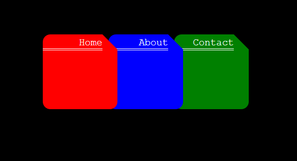
Недавно я отрезал верхний правый угол и наложил вкладки, подобные папкам. Полный код noob, поэтому игнорируйте shitty-код, но я сделал это, объединив квадрат, треугольник и прямоугольник... Это может быть или не быть новым подходом, но, надеюсь, кто-то сочтет это полезным.
https://i.stack.imgur.com/qFMRz.png
Вот HTML:
<!DOCTYPE html>
<html lang ="en">
    <head>
        <meta charset="UTF-8">
        <meta name="viewport" content="width=device-width, initial-scale=1">
        <link rel="stylesheet" type="text/css" href="style.css">
    </head>
    <body>
        <div class="folders">
            <div class="container">
                <div class="triangleOne">
                    <p class="folderNames">Home</p>
                </div>
                <div class="triangleOneCut">
                </div>
                <div class="triangleOneFill">
                </div>
            </div>

            <div class="container2">
                <div class="triangleOne blue">
                    <p class="folderNames">About</p>
                </div>
                <div class="triangleOneCut blueCut">
                </div>
                <div class="triangleOneFill blue">
                </div>
            </div>

            <div class="container3">
                <div class="triangleOne green">
                    <p class="folderNames">Contact</p>
                </div>
                <div class="triangleOneCut greenCut">
                </div>
                <div class="triangleOneFill green">
                </div>
            </div>
        </div>
    </body>
</html>
Вот CSS:
.triangleOne {
    height: 50px;
    width: 40px;
    background: red;
    border-radius: 5px 0px 0px 5px;
    position: absolute;
}

.triangleOneCut {
    content: '';
    position: absolute;
    top: 0; left: 40px;
    border-top: 10px solid transparent;
    border-left: 10px solid red;
    width: 0;
}

.triangleOneFill {
    content: '';
    position: absolute;
    top: 10px; left: 40px;
    width: 10px;
    height: 40px;
    background-color: red;
    border-radius: 0px 0px 5px 0px;
}

.container {
    position: relative;
    height: 50px;
    width: 50px;
    display: inline-block;
    z-index: 3;
}

.container2 {
    position: relative;
    height: 50px;
    width: 50px;
    display: inline-block;
    left: -10px;
    z-index: 2;
}

.container3 {
    position: relative;
    height: 50px;
    width: 50px;
    display: inline-block;
    left: -20px;
    z-index: 1;
}

.blue {
    background-color: blue;
}

.green {
    background-color: green;
}

.blueCut {
    border-left: 10px solid blue;
}

.greenCut {
    border-left: 10px solid green;
}

.folders {
    width: 160px;
    height: 50px;
    /* border: 10px solid white; */
    margin: auto;
    padding-left: 25px;
    margin-top: 100px;
}

.folderNames {
    text-align: right;
    padding-left: 2px;
    color: white;
    margin-top: 1.5px;
    font-family: monospace;
    font-size: 6.5px;
    border-bottom: double 1.5px white;
}
Еще одно решение: html:
<div class="background">
  <div class="container">Hello world!</div>
</div>
CSS:
.background {
  position: relative;
  width: 50px;
  height: 50px;
  border-right: 150px solid lightgreen;
  border-bottom: 150px solid lightgreen;
  border-radius: 10px;
}
.background::before {
  content: "";
  position: absolute;
  top: 0;
  left: 0;
  width: 0;
  height: 0;
  border: 25px solid lightgreen;
  border-top-color: transparent;
  border-left-color: transparent;
}
.container {
  position: absolute;
  padding-left: 25px;
  padding-top: 25px;
  font-size: 38px;
  font-weight: bolder;
}