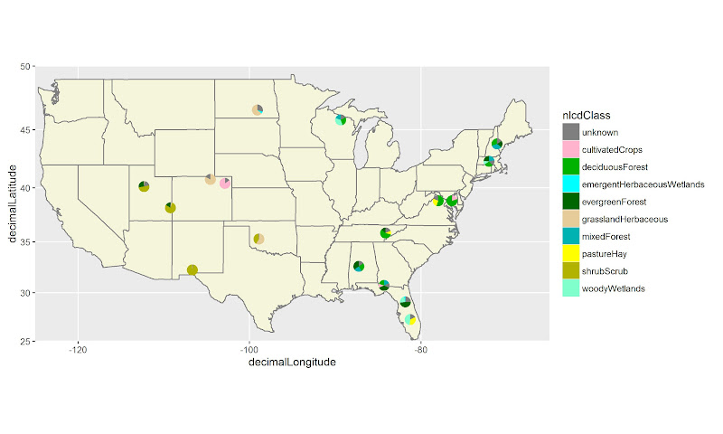
Это может быть вещь списка пожеланий, но не обязательно (возможно, для этого потребуется создание geom_pie). Сегодня я увидел карту (LINK) с круговыми графиками на ней, как показано здесь.

Я не хочу обсуждать достоинства кругового графика, это было больше упражнением, могу ли я сделать это в ggplot?
Я предоставил ниже набор данных (загруженный из моего окна), в котором есть данные сопоставления, чтобы составить карту штата Нью-Йорк и некоторые исключительно сфабрикованные данные о расовых процентах по округу. Я дал эту расовую составляющую как слияние с основным набором данных и как отдельный набор данных, называемый ключом. Я также думаю, что Брайан Гудрич ответил мне на другой пост (ЗДЕСЬ) по центрированию названий графств будет полезно для этой концепции.
Как мы можем сделать карту выше с помощью ggplot2?
Набор данных и карта без круговых диаграмм:
load(url("http://dl.dropbox.com/u/61803503/nycounty.RData"))
head(ny); head(key)  #view the data set from my drop box
library(ggplot2)
ggplot(ny, aes(long, lat, group=group)) +  geom_polygon(colour='black', fill=NA)

#  Now how can we plot a pie chart of race on each county
#  (sizing of the pie would also be controllable via a size
#  parameter like other `geom_` functions).
Заранее благодарим за ваши идеи.
EDIT: Я только что увидел еще один случай в junkcharts, который кричит для этого типа возможностей: